

Co-Parenting made simple
MVP Prototype Sprint
Role
Product Designer (solo)
Collaborator
Product Manager
Timeline
June 25 – July 3, 2025 (8 days)
Tools
Figma • Stitch • Mobbin
Project Background

Translating an emotional vision into a structured product
My business partner, Product Manager Adrian Cole, brought me into this one-week sprint to design a mobile app that helps divorced or separated parents co-parent with structure, emotional safety, and support. The end client, a healthcare executive, wanted a product that felt calm, trustworthy, and empowering. The challenge wasn’t defining what to build; it was designing something that balanced empathy, speed, and clarity within tight constraints.
The Challenge
Balancing emotional nuance with rapid delivery
With no user research, no testing, and just one week to deliver, the challenge was to turn an emotionally complex vision into something tangible and safe. The content covered high-stakes topics: custody, dating, sex, finances, and communication after separation, meaning tone mattered as much as functionality. The goal was to make technology feel empathetic, private, and empowering, not procedural or clinical.
My Process
Balancing structure, collaboration, and adaptability
Day 1–2: Definition
I started by reviewing the PRD and design brief to understand the client’s goals, constraints, and emotional tone. After meeting with the Product Manager to discuss feature prioritization, user flows, and use cases, I defined the core flow architecture and began early ideation in Stitch.
Day 3–5: Iteration
Using Stitch to explore visual and tonal directions, I refined layouts, hierarchy, and UX copy in Figma. This workflow allowed for rapid iteration without rebuilding from scratch. Midway through the sprint, we presented the first prototype to the client and received positive feedback, along with new direction on visual tone.
Day 6–8: Refinement
Adrian and the client collaborated on a quick branding deck in Canva, which guided the final color and tone adjustments. I implemented the updated palette and styling refinements, ensuring visual consistency and emotional warmth. The deliverables, a high-fidelity prototype and component-based visual system, are now paired with Adrian’s pitch deck to help the client secure development funding.
Key Design Decisions
Designing for pace, privacy, and empathy across every touchpoint.
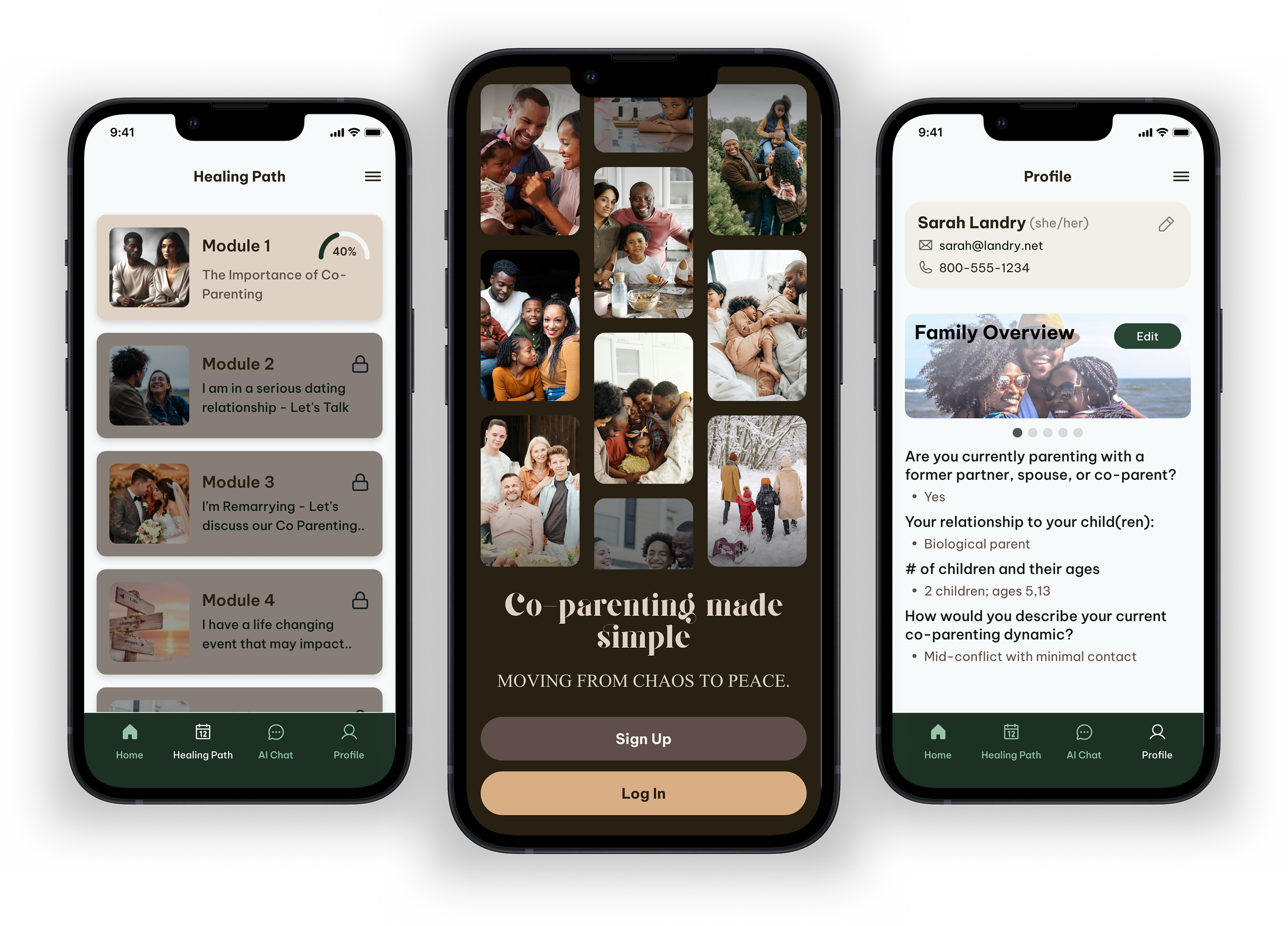
Healing Path LMS
Modular learning cards guide users through 26 topics over a year, each with short videos, reflection prompts, and micro-actions. The pacing was intentionally gentle, encouraging steady progress over urgency.
AI Decision Companion
A private chat experience helps parents prepare for difficult conversations. To protect boundaries, no sharing or export options were included in the MVP.
Support Flow
Instead of generic “Help” options, the support form includes categories like “Preparing for a tough conversation,” signaling empathy and practical guidance even in microcopy.
Onboarding Flow
Designed to feel conversational and validating, it captures emotional status, spiritual preferences, and co-parenting goals, allowing the system to personalize module pacing and content tone.
Outcome
Delivering a calm, emotionally intelligent MVP in one week
The initial scope included 16 high-fidelity screens covering core MVP flows. After the first client review, the scope expanded to include the full onboarding experience and one complete Healing Path module. This brought the total deliverables to 35 functional screens and 7 UI states, all refined and finalized within eight days.
Reflection
What I took away from building an emotionally driven product under real constraints
This sprint reinforced how critical tone and judgment are in emotionally sensitive design. AI tools like Stitch can accelerate exploration, but they still rely on human direction to shape clarity, hierarchy, and trust.
Looking back, this sprint was about turning a therapeutic idea into something real under real pressure. It reminded me how much intuition matters when speed and sensitivity have to coexist.