
Responsive Web Design
Role
UX / UI Designer • Researcher
Timeline
6 months
Tools
Figma • Balsamiq • Google Forms
Background


Craigslist is known for its simplicity, but its outdated design creates real friction for modern users — especially on mobile and tablet devices. Tiny text, cluttered navigation, and messaging that kicks users off the site make core tasks feel frustrating and disconnected.
This project set out to modernize Craigslist with a responsive, intuitive redesign — keeping its trusted, minimalist spirit while making it easier, safer, and more enjoyable to buy, sell, and connect.
Double Diamond Framework
I followed the Double Diamond framework to guide this project — using a structured process to research user needs (Discover), identify key pain points (Define), explore solutions through iteration (Develop), and deliver a focused, responsive redesign (Deliver).
This approach kept the project intentional and user-driven from start to finish.

Discover
Primary Research: Competitive Analysis
To better understand the landscape of online classifieds, I conducted a competitive analysis of Craigslist and its major alternatives, including Facebook Marketplace, OfferUp, and eBay. My goal was to evaluate where these platforms succeed, where they create friction, and what modern users expect from buying, selling, and messaging experiences.
The analysis revealed a major gap: While competitors offer mobile-first design, in-app messaging, and buyer protections, Craigslist remains limited by its dated interface and lack of integrated communication. Its simplicity is still a strength, but without modern usability and trust features, it risks falling behind platforms that make connection and safety feel effortless.
Primary Research: User Interviews
With a clearer view of the competitive landscape, I shifted focus to understanding how people navigate Craigslist today — and why some choose other platforms. I interviewed and conducted contextual observations with five participants, ranging from occasional Craigslist users to those loyal to alternatives like Facebook Marketplace and eBay.
💡 Key Themes & Insights
🧭 Easy Navigation & Search
Users found it relatively easy to search for items or create listings once they understood the basic flow.📩 Messaging Frustration
Participants struggled with the disconnected messaging system, preferring integrated communication options.🖥️ Outdated Visual Design
Users described the site as "janky," cluttered, and overwhelming—comparing it to old blogs or newspapers.
🔒 Trust & Safety Concerns
Some users questioned the legitimacy of listings and felt unsure using external communication methods.
These interviews validated key assumptions about Craigslist’s usability gaps while uncovering deeper needs around trust, mobile experience, and communication clarity.
Research Synthesis
100% of participants found Craigslist easy to search and post on, appreciating its straightforward structure
80% struggled with the messaging system, preferring platforms with built-in, internal communication
100% described the visual design as outdated, cluttered, or overwhelming compared to modern platforms
60% raised concerns about trust and legitimacy when using external contact methods
Simplifying homepage navigation and adding integrated messaging were frequent requests across interviews
Research validated early assumptions around Craigslist’s usability gaps and revealed a stronger need for streamlined communication, visual clarity, and trust-building features to meet modern user expectations.
Based on these synthesized insights, I created user personas to represent the key needs, behaviors, and pain points uncovered in research.
Personas
Define
POV:
Potential buyers who are concerned with legitimacy, personal safety, and staying organized feel frustrated with having to message sellers outside of the platform — especially when they’re used to similar platforms that offer built-in messaging.
HMW:
How might we improve trust, safety, and organization by streamlining communication between buyers and sellers?
POV:
Users who appreciate the polished design of competitors like Facebook Marketplace find Craigslist’s layout outdated and overwhelming — often describing it as "reading a newspaper" or "scrolling through a blog."
HMW:
How might we make Craigslist’s design more enjoyable and its content more digestible, so users are more likely to browse and engage?
POV:
Some users who prefer competing platforms — and are loyal to brands like Facebook Marketplace and eBay — enjoy seeing promotions or targeted content while browsing, and miss this kind of experience on Craigslist.
HMW:
How might we display more relevant content and promotions to increase user engagement, satisfaction, and trust?
Prioritization
After synthesizing user needs and brainstorming feature concepts, I prioritized potential solutions based on user impact, development effort, and feasibility.
Renaming the "Reply" CTA to "Contact"
Reorganizing homepage layout
Building internal messaging
Making the site fully responsive
Exploring a design system refresh
To guide decision-making, I mapped these ideas using an Impact–Effort Matrix.
High-impact, lower-effort improvements—such as renaming the "Reply" CTA and reorganizing the homepage—were prioritized for early wins.
Essential higher-effort features—like internal messaging and a fully responsive site—were also included to directly address critical user frustrations.
Lower-priority enhancements, such as a full design system refresh, were scoped for future phases.
Impact-Effort Matrix
After prioritizing key features, I mapped out Craigslist’s current buy and sell flows to spot pain points and guide the structure of the redesign. I focused on simplifying essential actions like browsing, posting, and contacting sellers—ensuring the platform stayed true to its straightforward roots while making core tasks faster, clearer, and more intuitive across devices.
Develop
User Flows
Low Fidelity Wireframes

User testing on the low-fidelity wireframes confirmed that the core structure and flows resonated with participants.
Testers responded positively to the simplicity and clarity of the layouts, and no major usability issues were identified.
Lo-Fi Usability Testing
Validate core user flows:
Navigate to an item listing
Message the seller
Log in
Post an item for sale
👥 Participants
5 testers
🗂️ Format
Moderated remote sessions
(~30 min)
With this validation, I moved into mid-fidelity design—focusing on strengthening the UI structure, refining task flows, and ensuring the layouts remained clear and intuitive before moving into high-fidelity visual design.
Mid Fidelity
User testing on the mid-fidelity wireframes confirmed that the core structure and flows felt intuitive. Testers moved through the layouts easily, but some had trouble finding the messaging option hidden in the "Contact" dropdown.
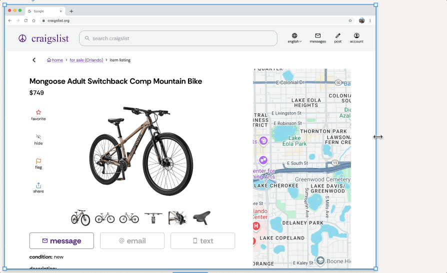
I updated the design to use dedicated buttons for "Message," "Email," and "Text." In a second round of testing, participants quickly found and used the new "Message" button, confirming the update improved clarity without disrupting the flow.
Mid-Fi Usability Testing
Validate core user flows:
Navigate to an item listing
Message the seller
Log in
Post an item for sale
👥 Participants
5 testers
🗂️ Format
Moderated remote sessions
(~30 min)


Before
After
With this validation, I moved into the Deliver phase—finalizing high-fidelity designs that modernized Craigslist’s visual hierarchy, strengthened UI clarity, and ensured a fully responsive experience across mobile, tablet, and desktop screens.
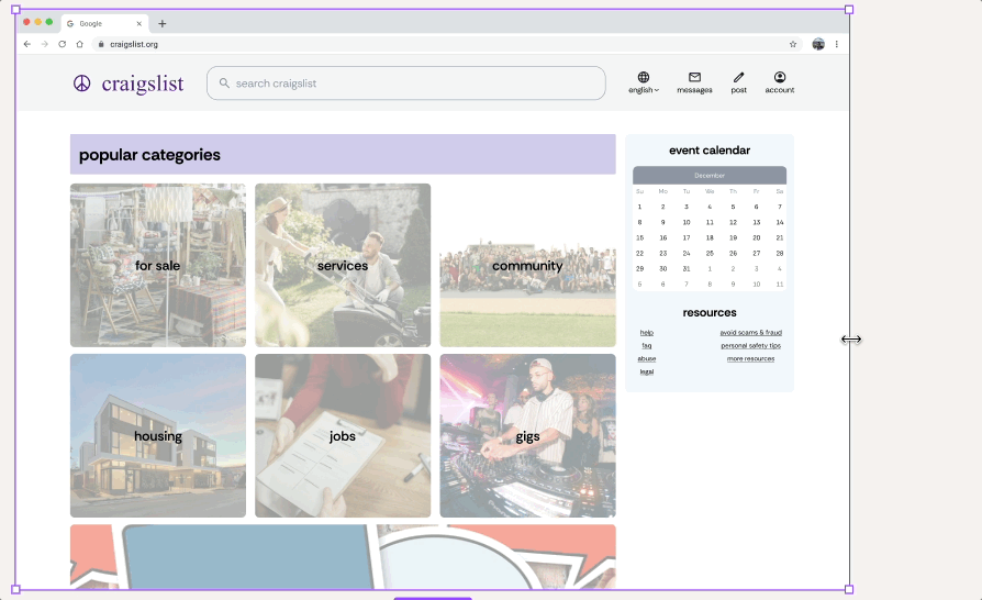
Home Page

Desktop

Desktop
Hi-Fi Usability Testing
Core Flows:
Navigate to an Item Listing
Message the Seller
Sign Up for an Account
Post an Item for Sale
👥 Participants
5 testers
🗂️ Format
Moderated remote (~45 min)

Tablet

Tablet

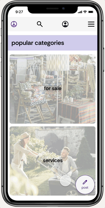
Mobile
User testing on the high-fidelity prototype confirmed that the structure and responsiveness felt intuitive across devices. Testers completed all key tasks and responded positively to the updated layouts, praising the clearer touch targets, better readability, and smoother flows. Feedback specifically pointed to improving the mobile messaging experience for better usability.

Mobile
Item Listing
Iterations
Messaging screen expanded to fullscreen to improve readability and reduce visual constraints on mobile.
Before
After
What’s Next
Next, I’d like to conduct usability testing specifically focused on the updated mobile messaging layout to ensure it feels natural across real devices and screen sizes. Beyond individual task completion, I want to measure long-term user behavior—how often users return, complete listings, and successfully connect with others over time.
I'm also interested in stress-testing the mobile experience under real-world conditions, validating accessibility standards, and exploring ways to strengthen emotional trust through small design signals. Ultimately, my goal is to ensure the redesign doesn’t just improve usability, but rebuilds Craigslist’s relevance and reliability in a mobile-first world.
Reflections
This project pushed me to think more critically about what it means to modernize a legacy platform while staying true to its core identity.
I had to balance improving usability, responsiveness, and trust, while thoughtfully updating the design to feel cleaner, clearer, and more accessible without losing what made Craigslist recognizable.
On a practical level, I grew significantly in my technical skills—especially around building fluid, responsive layouts using Auto Layout. Learning how to structure flexible components that rearrange naturally as frames resized gave me a much deeper understanding of designing for different devices and screen sizes.
Beyond technical growth, this project challenged me to prioritize improvements based not just on usability wins, but on real-world effort and long-term user value. It reinforced the importance of planning for behavior over time, not just optimizing for task success in a testing session.
Ultimately, this project wasn’t just about making Craigslist look better—it was about helping it evolve in a way that better meets the needs of today’s users.