


Helping people where they need it, when they need it.
End-to-End Mobile App
Role
UX / UI Designer • Researcher
Timeline
4 weeks
Tools
Figma • Google Forms
Background
Dating can be overwhelming for neurodivergent individuals, with challenges like social anxiety, communication struggles, and sensory overload.
Most apps don’t account for these needs, leaving users feeling isolated or unseen.
nAura set out to change that—creating a calmer, clearer dating experience that supports emotional clarity, autonomy, and meaningful connection.

Design Thinking Framework
I followed a Design Thinking approach throughout the nAura project—empathizing with users, defining key challenges, ideating solutions, prototyping, and testing.
Each phase was focused on reducing overwhelm, promoting emotional clarity, and supporting autonomy for neurodivergent users.
This iterative process helped ensure the final design was both functional and deeply human-centered.

Primary Research: Competitive Analysis
To better understand the landscape of both neurodivergent-focused and mainstream dating platforms, I first conducted a competitive analysis of existing apps. My goal was to identify where current solutions succeed, where they fall short—particularly for neurodivergent users—and where there’s space for innovation.
My analysis revealed a significant opportunity:
There is currently no dating app that successfully combines neurodivergent-first accessibility with the user experience quality of mainstream platforms. Most options either lack critical support features or fail to foster genuine, low-pressure connection.
Primary Research: User Interviews
To better understand the needs and challenges of neurodivergent individuals in dating, I interviewed five participants with a range of lived experiences—including Autism, ADHD, Dyslexia, and Social Anxiety.
Afterwards, I create an Affinity Map to synthesize the data:
💡 Key Themes & Insights
🧠 Overwhelm & UI Overload
Users feel overwhelmed by fast-paced, cluttered interfaces
💬 Communication Anxiety
Users feared being misunderstood, forgot to reply, or struggled with unclear tone and timing
🛡️ Need for Boundaries
Participants want quick ways to set communication boundaries
🛠️ Customization & Control
Customization (text size, brightness, audio options) reduces cognitive load
🎯 Feature Preferences
Built-in prompts & conversation guidance
Option to set intentions: friendship, romance, or both
Text-to-audio options, dark mode, and dyslexia-friendly layouts
These interviews helped validate many of my initial assumptions surrounding communication support while introducing new perspectives—especially around the importance of reducing sensory and social pressure in dating spaces.
Personas
Research Synthesis
100% of participants felt overwhelmed by fast-paced, cluttered interfaces
80% experienced communication anxiety (fear of misunderstanding, delayed responses)
100% emphasized the need for clear boundary-setting tools
80% valued the ability to set relationship intentions (friendship, romance, or both)
Customization features (text size, dark mode, audio options) were frequently requested to reduce cognitive load
Research validated early assumptions about communication support and uncovered a deeper need for emotional clarity and sensory accessibility.
Define & Ideate
POV:
Neurodivergent users feel anxious and stressed when starting or keeping conversations going due to unclear expectations and communication norms.
HMWs:
How might we make conversations less stressful and easier to follow?
How might we provide clear, low-pressure ways to start conversations?
POV:
Busy visuals and long blocks of text on dating apps overwhelm ND users and hinder connection.
HMWs:
How might we create visually calm, accessible experiences?
How might we accommodate different sensory needs in app design?
POV:
ND users often struggle to express boundaries, preferences, or traits, leading to discomfort and mismatches.
HMWs:
How might we help users easily share boundaries and ND traits?
How might we normalize clear interaction preferences from the start?
Prioritization
After defining key opportunity areas through POVs and HMWs, I moved into ideation—brainstorming features that could directly address users’ emotional, sensory, and communication needs.
The initial list of features included:
AI Assistant for conversation support
Friend vs. Romance intention setting
Customizable trait and interest selection
Accessibility settings (dark mode, text scaling, reduced contrast)
Conversation prompts and icebreakers
Block/report functionality for safety
Mood/status indicators (explored, but later deprioritized)
Customizable communication preferences (e.g., "slow replier" tags)
Preview multiple profiles before opening full profile view
Gentle notification settings to reduce overwhelm
These ideas were then evaluated and prioritized using an Impact–Effort Matrix to determine which features would be included in the first prototype.
I created an Impact–Effort Matrix to evaluate and prioritize features based on user insights, accessibility needs, and feasibility.
High-impact, low-effort features—such as block/report, conversation prompts, and gentle notifications—were prioritized and implemented.
Some higher-effort concepts, like sensory settings (e.g., dark mode, reduced contrast), were thoughtfully considered and visually represented in the design, though not functional in the prototype due to time constraints.
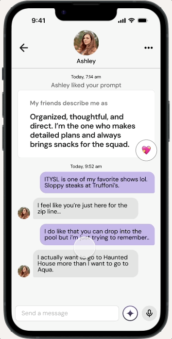
Notably, the AI Assistant, originally assumed to be a high-effort feature, was successfully implemented in a lightweight form and included in the final high-fidelity designs.
After prioritizing key features, I mapped out nAura’s main user flows to guide the structure of the app.
I organized essential actions like discovering profiles, matching, and editing personal settings into a simplified sitemap, ensuring the experience stayed lightweight and easy to navigate.
Sitemap

User Flow
After mapping the structure and user flows, I moved into low-fidelity wireframes to visualize core interactions.
Low Fidelity Wireframes

Lo-Fi Usability Testing
Validate core user flows:
Create Profile
Match with Someone
Message Someone
Edit Profile
👥 Participants
5 neurodivergent users with varied traits and preferences
🗂️ Format
Moderated remote sessions
(~15 min)
User testing on the low-fidelity wireframes confirmed that the core structure and flows resonated with our participants.
Testers successfully completed key tasks like onboarding, profile creation, matching, and messaging with minimal friction, and they responded positively to the simplicity and clarity of the layouts.
With this validation, I moved into high-fidelity design—focusing on refining visual hierarchy, typography, and accessibility features like text scaling, sensory-friendly color palettes, and conversation support tools.

Hi-Fi Usability Testing
Core Flows:
Onboarding & Profile Creation
Discover & Match
Messaging & AI Assistant Interaction
View & Edit Profile
Preferences & Settings (font size, dark mode)
👥 Participants
6 neurodivergent users with varied traits and preferences
🗂️ Format
Moderated remote sessions
(~60 min)
✅
What Worked
5/6: AI Assistant eased messaging
5/6: Profile layout felt intuitive
5/6: Visual design was calming
4/6: Understood friend vs. romance distinction
⚠️
Pain Points
3/6: Text-heavy screens caused fatigue
3/6: Match flow unclear, no feedback
2/6: Would like to use Sensory Settings (Dark Mode, Font, etc.)
1/6: Felt “Discover” label was misleading
💡
What to Improve
Break up long forms / reduce text density
Add match confirmation / interaction feature
Implement Dark Mode feature and other Sensory Settings
Consider renaming “Discover” label or changing the flow
User testing on the high-fidelity prototype surfaced areas where the experience still needed refinement.
While the overall structure was functional, feedback revealed opportunities to improve clarity, reduce cognitive load, and better support user autonomy.
Iterations


Menus collapsed by default to reduce visual clutter

Before
After
Replaced red report icon in chat with a three-dot menu to avoid unintentionally alarming users and provide additional options like ‘Move to Friends’ and ‘Unmatch’
Added confirmation dialogs for key actions:
Profile creation
Matching
Saving profile changes
These help reduce uncertainty and reinforce task completion—providing clarity and reassurance for users who may struggle with ambiguity or executive functioning.
Redesigned Discover flow to preview multiple profiles before expanding into a full profile view.
Gives users more control and pacing when browsing
Reduces cognitive load by breaking up information
Enables low-pressure browsing by reducing decision fatigue.
Before
After
UI Kit
Interactive Prototype
What’s Next
Short-Term Priorities
Run another round of usability testing to validate flows like matching, messaging, and AI Assistant support
Make accessibility settings functional, including dark mode, reduced contrast, and font scaling
Refine onboarding to reduce cognitive load, likely using progressive disclosure and improved layout
Explore ways to communicate interaction preferences between matched users, helping set mutual expectations and promote a safer, more inclusive experience
Long-Term Goals
Expand the AI Assistant with tone adjustment, journaling prompts, and adaptive support
Build toward an MVP-ready prototype for testing with real neurodivergent communities
Introduce mood indicators that allow users to share their emotional availability or current headspace—promoting empathy and reducing pressure in conversations
Develop friendship-first features and non-romantic pathways
Continue centering ND voices in every iteration through direct feedback and co-creation
Reflections
Working on nAura challenged me to design for safety, clarity, and inclusion—especially for users who are often overlooked in mainstream experiences.
This project was personal. Growing up with family members on the autism spectrum and an uncle with an intellectual disability shaped how I view empathy, and inspired me to create something that makes people feel seen, respected, and in control.
What started as a simple dating app idea grew into a deeper exploration of emotional clarity, autonomy, and reducing overwhelm.
While I initially thought the AI Assistant would be too complex to include, it became one of the most meaningful features. Other ideas, like mood indicators, proved to be more nuanced and were set aside for future exploration.
Through this project, I learned that prioritization is an act of empathy. Great design isn’t just about functionality—it’s about how people feel. nAura made me a more reflective and intentional designer, and that's something I’ll carry forward.
