

Reimagining how people connect after live events
0 to 1 MVP Sprint
Role
Product Designer (solo)
Collaborator
Adrian Cole (Product Manager)
Sprint Timeline
June 25 – July 3, 2025 (8 days)
Tools
Figma • Stitch • Mobbin
Background

Bringing intentional networking to live events
TapIn is a live event networking platform that gives attendees event-specific profiles — allowing them to see who “tapped in” and connect more intentionally.
After the MVP launch, I was brought on to expand the platform’s feature set, leading the design of AI Introductions — a new capability that helps attendees discover valuable connections they might have missed in person.
The Problem
Networking at events is often messy and inefficient. It’s hard to know who’s worth connecting with, and most people don’t have the time or confidence to meet everyone who could actually help them.

The Goal
Use AI to make networking more intentional and personal — helping attendees discover connections they might have missed in the moment.

The Solution
AI Introductions recommends relevant attendees based on shared roles, goals, and interests. Twenty-four hours after the event, users get a personalized email with suggested matches and can explore more on the event page through gradient AI cards.

Process
Designing for clarity, consistency, and connection
The PM and I first discussed which data inputs would drive AI Introductions and how they could best match attendees. From there, I focused on translating that logic into a clean, approachable design that felt native to TapIn’s system.
I redesigned the attendee cards to signal AI assistance through gradients — a visual cue often associated with AI features. Designing for both mobile and desktop was a challenge, especially with the new section explaining why someone was recommended. The added content made cards feel cramped, so I reworked the layout to open up whitespace and improve readability across devices.
We decided to notify users 24 hours after the event, giving them time to reset while keeping the experience fresh. On the event page, AI Introductions appear above the attendee list, with a “More AI Recommendations” button that lets users explore additional matches at their own pace.
Every decision came down to clarity and trust — making AI Introductions feel natural, helpful, and human.
Define
Aligned with Adrian on business goals and user pain points. We identified a need to extend TapIn’s networking experience beyond the event itself, using attendee data to drive meaningful engagement.
Define
Aligned with Adrian on business goals and user pain points. We identified a need to extend TapIn’s networking experience beyond the event itself, using attendee data to drive meaningful engagement.
Ideate
Aligned with Adrian on business goals and user pain points. We identified a need to extend TapIn’s networking experience beyond the event itself, using attendee data to drive meaningful engagement.
Define
Aligned with Adrian on business goals and user pain points. We identified a need to extend TapIn’s networking experience beyond the event itself, using attendee data to drive meaningful engagement.
Key Design Decisions
Designing for pace, privacy, and empathy
Healing Path LMS – I designed modular learning cards that guided users through 26 topics over a year, each featuring short videos, reflection prompts, and micro-actions. The pacing was intentionally gentle, encouraging steady progress rather than urgency.
AI Decision Companion – I created a private chat experience where parents could prepare for difficult conversations. Visual tone indicators (emoji-coded) represented conflict and confidence levels, giving users emotional awareness at a glance. To protect boundaries, no sharing or export options were included in the MVP.
Onboarding Flow – I designed onboarding to feel conversational and validating. It captured emotional status, spiritual preferences, and co-parenting goals, allowing the system to personalize module pacing and content tone.
Support Flow – Instead of generic “Help” options, I designed categorized support requests (e.g., “Preparing for a tough conversation”), signaling empathy and practical guidance.
POV:
Spotify users are eager to explore new music through channels beyond curated playlists, signaling a need for more diverse and personalized discovery methods.
HMWs:
How might we expand music discovery options for users who want more than just curated playlists?
POV:
Some users struggle to accurately identify songs they hear, as current audio fingerprinting tools fall short in both reliability and integration with Spotify.
HMW:
How might we enable users to instantly recognize songs and seamlessly add them to their library using a more accurate and integrated solution?
POV:
Users interested in hands-free control often avoid using Spotify’s voice commands due to poor natural language comprehension and limited functionality across tasks and devices.
HMW:
How might we redesign voice interactions so users can intuitively request curated music or identify songs on the go?
Outcome
Shaping TapIn’s vision for smarter networking
Even though AI Introductions hasn’t launched yet, it quickly became TapIn’s competitive advantage and will be a core feature going forward.
The feedback from the team was really positive — especially around how clean and natural the feature felt. The gradients instantly read as “AI,” and the flow between the attendee list and recommendations made the experience feel smooth and intuitive.
This project helped set the tone for how TapIn will bring AI into the product moving forward — not as a gimmick, but as something that actually makes networking feel easier and more human.
After prioritizing key features, I mapped out Spotify’s new user flows to guide the structure of the added experiences.
I organized essential actions like activating voice control, identifying songs, and saving discovered music into a simplified sitemap—ensuring the experience stayed lightweight, intuitive, and easy to access on the go.
Next Steps
Extending the experience beyond design
Next, I plan to design the email template that introduces users to their AI Introductions — something that feels personal and true to TapIn’s brand, not like another generic notification. I’ll also explore in-app notifications as a lighter, more immediate way to re-engage users who might miss the email.
Both of these touchpoints will help close the loop on the experience — giving users a clear, simple way to rediscover the people they might’ve missed and keep the connections going beyond the event.

Hi-Fi Usability Testing
Core Flows:
Access ‘Hey Spotify’ feature
Access Audio Fingerprinting feature
Enable ‘Hey Spotify’ in Settings
Enable Audio Fingerprinting in Settings
👥 Participants
5 testers who stream music daily, like discovering new music, and rarely use voice assistants
🗂️ Format
Moderated remote sessions through Participate
(~30 min)
✅
What Worked
5/5 successfully completed all tasks with high confidence
4/5 of users found the features easy to access and intuitive
Users felt the experience aligned well with Spotify’s existing design system
⚠️
Pain Points
3/5 were confused by the Terms & Conditions flow and requested a button or confirmation modal.
2/5 made errors trying to locate feature settings
2/5 suggested feature icons should look more like buttons or cards
1 user found "Audio Fingerprinting" terminology unclear
User testing on the high-fidelity prototype surfaced areas where the experience still needed refinement.
While the overall structure felt intuitive and aligned with Spotify’s design system, feedback revealed opportunities to improve clarity, streamline interactions, and make key features easier to find and use.
💡
What to Improve
Add clear confirmation after accepting Terms & Conditions
Simplify confusing labels in Settings (e.g., clarify “Voice Interactions”)
Improve discoverability with better onboarding and clearer home screen access
Redesign icons to feel more interactive and recognizable
Use more intuitive language for features (e.g., rename "Audio Fingerprinting")
Iterations
Hey Spotify flow
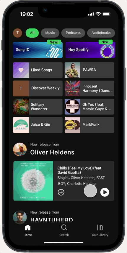
Added a launch modal to onboard users to “Hey Spotify” and “Song ID,” improving feature awareness and discoverability.
Redesigned feature icons and layout using colorful, tappable cards with “New!” labels to enhance visual clarity and interaction.
Renamed “Audio Fingerprinting” to “Song ID” to make the feature’s purpose more understandable to users.
Added a confirmation button that only becomes active after users accept Terms & Conditions, creating a smoother and clearer opt-in flow
Song ID flow
Relabeled “Voice Interactions” to “Hey Spotify & Song ID” in Settings to make the feature entry point clearer and more direct for users.
UI Kit

Interactive Prototype
What’s Next
Next, I want to keep improving the onboarding experience and test how users respond over time. I’m also curious about responsibly using listening behavior data to personalize feature discovery and refine future updates based on real user needs.
Reflections
This project challenged me to think critically about how users discover and interact with new features — especially when those features are meant to improve safety and convenience. Through research, I realized that Spotify’s decision to discontinue "Car Thing" validated the need for better hands-free options like "Hey Spotify" and "Song ID." It confirmed that I was solving a real gap users were facing.
One of the biggest lessons I took away was to not overlook user pain points, even when they seem small. After early usability testing, I had enough feedback to realize that "Audio Fingerprinting" needed a more intuitive name and that users needed better onboarding. At first, I didn’t act on those insights — but addressing them in the high-fidelity iterations showed me how much even small changes can dramatically improve user confidence and experience.
I also strengthened my technical skills, especially in building more realistic, conditional prototypes that better mirror real-world behavior.
Overall, this project reinforced that good design is often invisible — it quietly clears the way so users can focus on what they actually want to do. Moving forward, I want to keep sharpening that mindset: staying responsive to user feedback, trusting the data, and designing experiences that feel natural, helpful, and human.